In this post we are going to discuss using msDropDown plugin with tooltips plugin. First lets study the post for how to use msDropDown here. We are going to use the source code specified in that code.
To continue with tooltips implementation with msDropDown, we can first explore the generated HTML for the dropdown in the previous post.
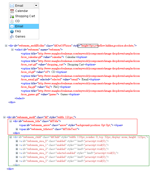 First part(part 1) of the image is the UI of the rendered dropdown. Second part(part 2) is the actual dropdwn we have . And the third part(part 3) of the image is the generated HTML by the msDropDown plugin. Lets study the HTML a little.
If we notice the HTML generated in part 2, the select is inserted in a div and the div height is made to zero. So, the actual dropdown is made hidden. And if we notice the part 3 HTML, we can see the select got converted to a div which contains two child divs. The red box contains the HTML for the selected option. And the green box contains the all options. Each option has converted to anchor(<a> tag) with id like selectID_msa_index. If we notice we can see that each index corresponds to the index of corresponding select option.
Now adding tooltips to the select > option is nothing but adding tooltips to the anchor tag. Let us implement tooltips now. First let us add some dummy attribute to the option tag that represent the tooltip. In this case we are using attribute named tooltipdata like below-
Next we can use this function to implement tooltips plugin. As we have already seen the id of the generated anchor selectID_msa_index, we can get the index from the id and find corresponding option from the select. If we can get the option from the select then we can read the value attribute toolltipdata from the option, which is nothing but the tooltip text we need to show in the tooltip of the anchor. We can to this by the following selector. Here this is nothing but the anchor.
Now if we want to add tooltip to selected item, we can achieve it with little more effort. If we notice part 3, red square section is the HTML for the selected item. The container has a css class named ddTitle. To add tooltip to the selected item is nothing but adding tooltip to the div with class ddTitle. We can do this by enabling tooltip for ddTitle inside document.ready. Code goes here-
To continue with tooltips implementation with msDropDown, we can first explore the generated HTML for the dropdown in the previous post.
If we notice the HTML generated in part 2, the select is inserted in a div and the div height is made to zero. So, the actual dropdown is made hidden. And if we notice the part 3 HTML, we can see the select got converted to a div which contains two child divs. The red box contains the HTML for the selected option. And the green box contains the all options. Each option has converted to anchor(<a> tag) with id like selectID_msa_index. If we notice we can see that each index corresponds to the index of corresponding select option.
Now adding tooltips to the select > option is nothing but adding tooltips to the anchor tag. Let us implement tooltips now. First let us add some dummy attribute to the option tag that represent the tooltip. In this case we are using attribute named tooltipdata like below-
<select name="webmenu" id="webmenu">
        <option value="calendar" tooltipdata="Calendar tip" title="http://www.marghoobsuleman.com/mywork/jcomponents/image-dropdown/samples/icons/icon_calendar.gif">
            Calendar</option>
        <option value="shopping_cart" tooltipdata="Shopping Cart tip" title="http://www.marghoobsuleman.com/mywork/jcomponents/image-dropdown/samples/icons/icon_cart.gif">
            Shopping Cart</option>
        <option value="cd" tooltipdata="CD tip" title="http://www.marghoobsuleman.com/mywork/jcomponents/image-dropdown/samples/icons/icon_cd.gif">
            CD</option>
        <option value="email" selected="selected" tooltipdata="Email tip" title="http://www.marghoobsuleman.com/mywork/jcomponents/image-dropdown/samples/icons/icon_email.gif">
            Email</option>
        <option value="faq" tooltipdata="FAQ tip" title="http://www.marghoobsuleman.com/mywork/jcomponents/image-dropdown/samples/icons/icon_faq.gif">
            FAQ</option>
        <option value="games" tooltipdata="Games tip" title="http://www.marghoobsuleman.com/mywork/jcomponents/image-dropdown/samples/icons/icon_games.gif">
            Games</option>
    </select>
Before implementing tooltip, we need to add the following file references-
<script src="http://jquery.bassistance.de/tooltip/jquery.tooltip.js" type="text/javascript"></script>
    <link href="http://jquery.bassistance.de/tooltip/jquery.tooltip.css" rel="stylesheet"
        type="text/css" />
Now lets modify the msDropDown plugin initialization code. If we go to the plugin documentation we can see that the plugin can accept a function as a parameter that gets called after the plugin initialization happens. So we can add a function like-
<script language="javascript">
        $(document).ready(function (e) {
            try {
                $("#webmenu").msDropDown({ onInit: callAfterInitialization });
            } catch (e) {
                alert(e.message);
            }
        });
        function callAfterInitialization() {
        }
    </script>
In our case we are we are adding a function named callAfterInitialization to onInit parameter of the msDropDown plugin.
Next we can use this function to implement tooltips plugin. As we have already seen the id of the generated anchor selectID_msa_index, we can get the index from the id and find corresponding option from the select. If we can get the option from the select then we can read the value attribute toolltipdata from the option, which is nothing but the tooltip text we need to show in the tooltip of the anchor. We can to this by the following selector. Here this is nothing but the anchor.
$("select[id*=webmenu] option:eq(" +
this.id.substring(this.id.lastIndexOf("_") + 1) + ")").attr("tooltipdata");
So the full function definition goes like below-
        function callAfterInitialization() {
            $("a[id*=webmenu]").tooltip({
                track: true,
                delay: 0,
                showURL: false,
                fade: 250,
                bodyHandler: function () {
                    return $("select[id*=webmenu] option:eq(" + this.id.substring(this.id.lastIndexOf("_") + 1) + ")").attr("tooltipdata");
                },
                showURL: false
            });
        }
And finally to make sure the tooltip is always on the top, we can change the z-index property of the tooltip to a very higher value.
<style>
        div#tooltip
        {
            z-index: 20000;
        }
    </style>
In this case the tooltip is nothing but a div with id tooltip. You have to check the generated id for your tooltip.
Now if we want to add tooltip to selected item, we can achieve it with little more effort. If we notice part 3, red square section is the HTML for the selected item. The container has a css class named ddTitle. To add tooltip to the selected item is nothing but adding tooltip to the div with class ddTitle. We can do this by enabling tooltip for ddTitle inside document.ready. Code goes here-
$("div[id*=_msdd] div.ddTitle").tooltip({
                track: true,
                delay: 0,
                showURL: false,
                fade: 250,
                bodyHandler: function () {
                    return $("select[id*=" + this.id.substring(0, this.id.indexOf("_") - 1) + "] option:selected").attr("tooltipdata");
                },
                showURL: false
            });
What we are doing in bodyHandler is finding the selected option in the original drop down and adding it as the body of the tooltip. While selected index changes, the msDropDown plugin is also internally changing the selected index of the hidden drop down.
